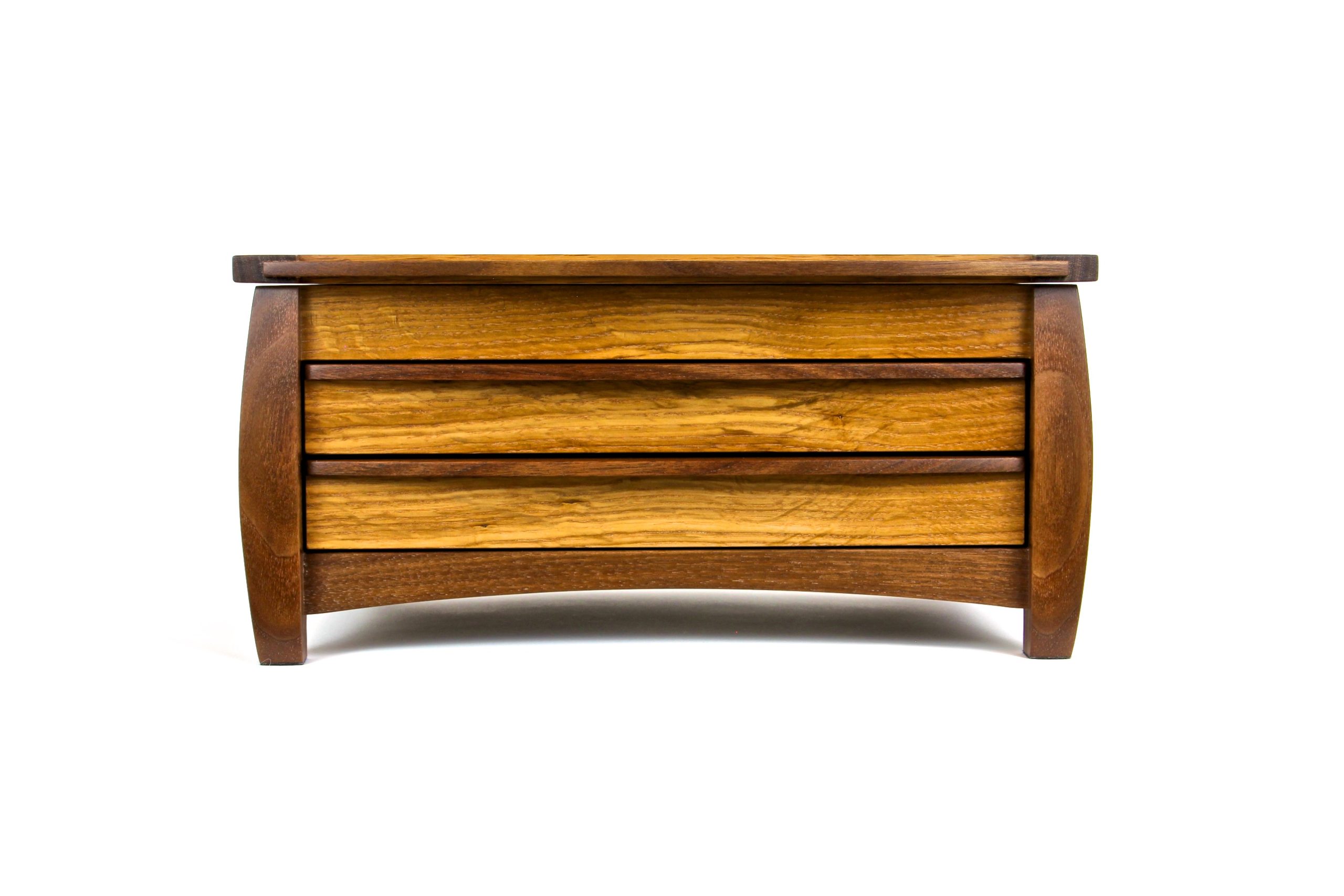
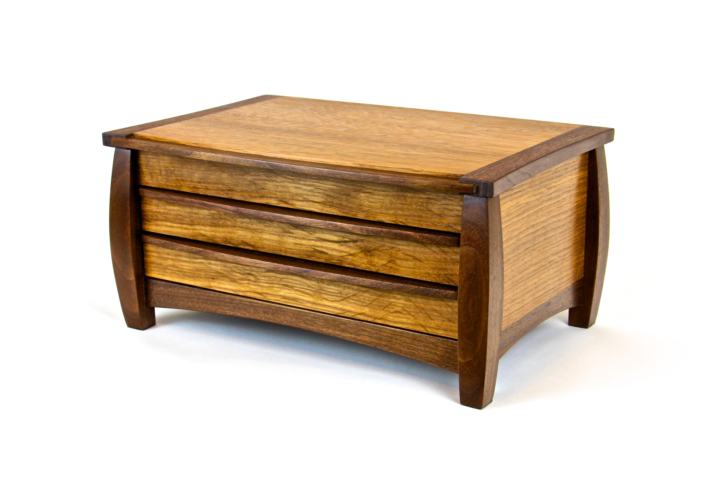
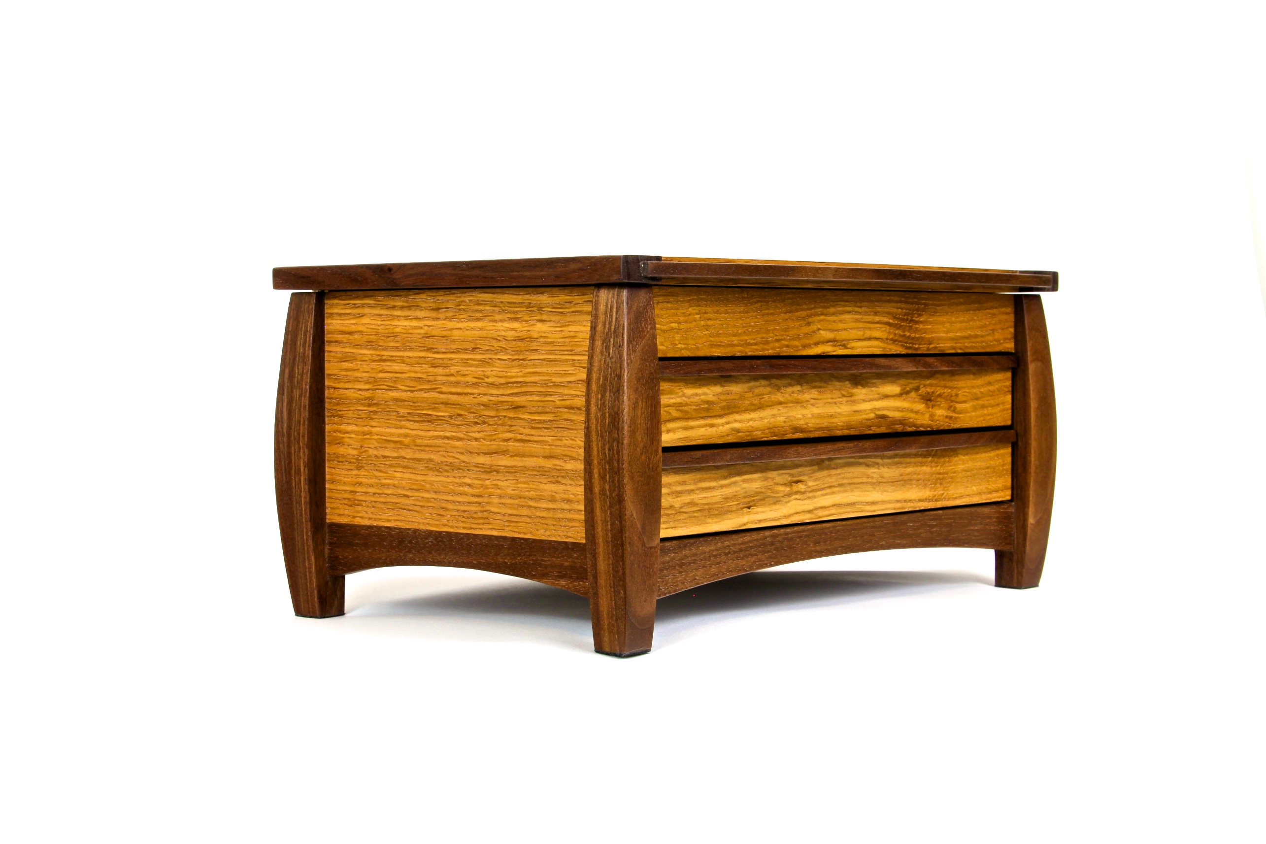
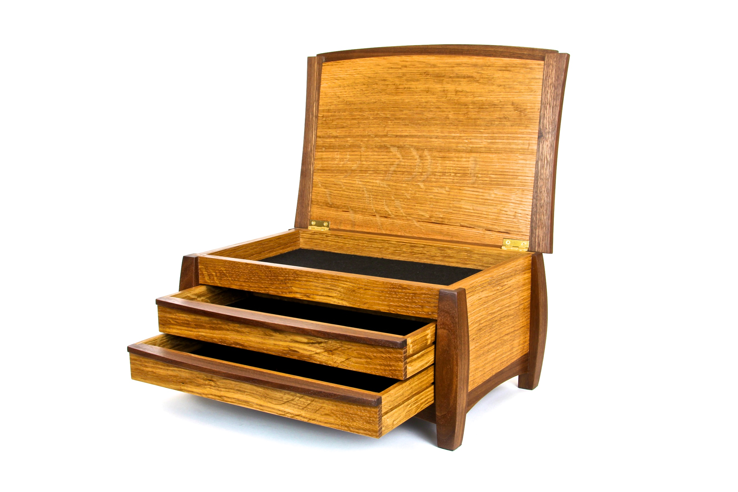
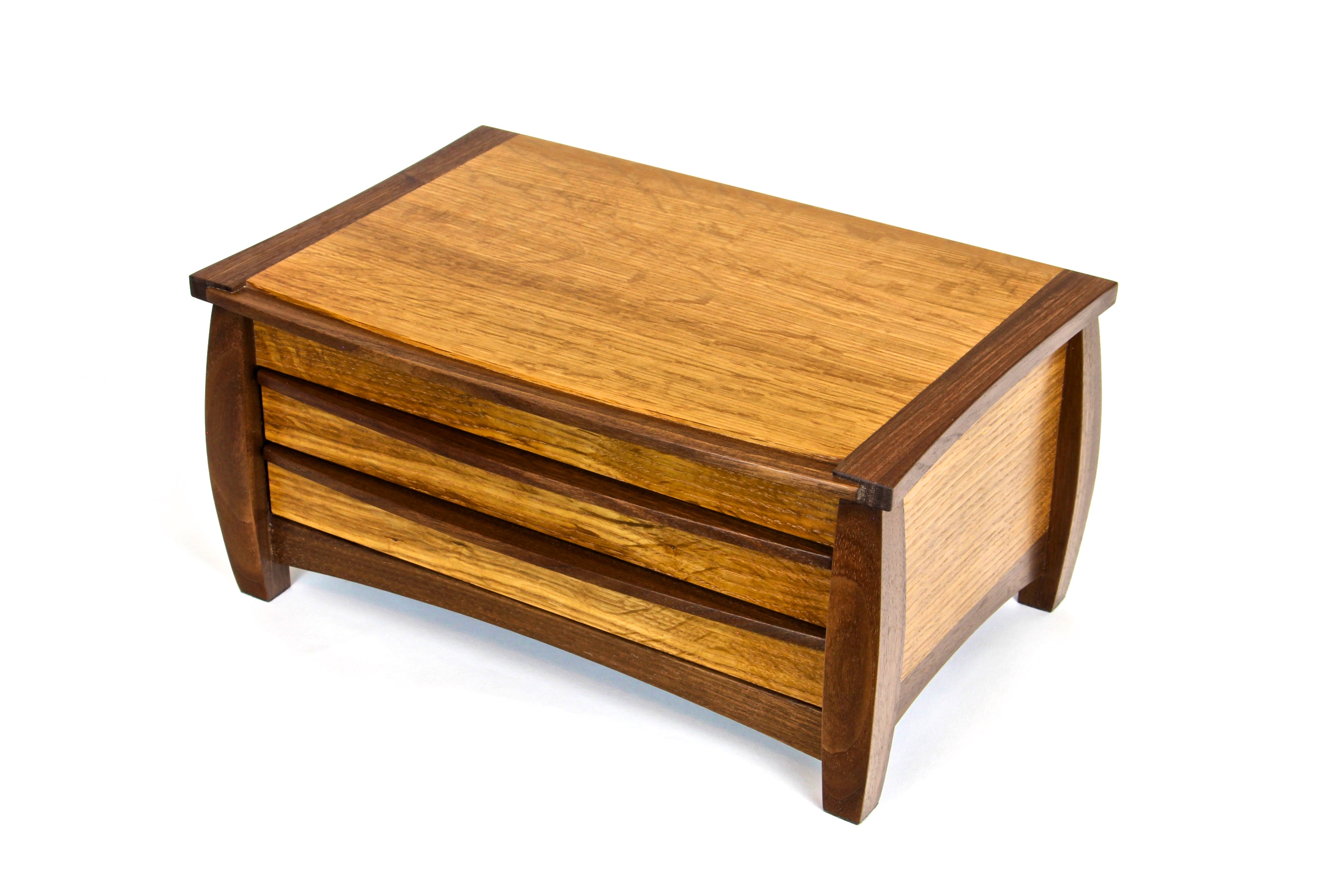
Just finished another jewelry box in quarter-sawn white oak and walnut. It is a reproduction of a design that caught my attention back in 2005 mainly because of the number curves in the design, both concave and convex. But the photos of the original piece that I saw turned me off because of the choice of woods used. It was constructed from very light-colored curly maple and very dark wenge (pronounced WHEN-ghay). Those woods were chosen because of their resulting high contrast to reinforce the contemporary design goal. Even though the overall look of the finished piece did not appeal to me, the basic design did and I saved the photos for my design-inspiration files. I finally decided to build this piece but with a wood selection that was more personally pleasing, as well as with lumber that I already had in my shop.
Because I love the Mission style I always have quarter-sawn white oak in supply and I also seem to have walnut too. To me this is a very pleasing wood combination. I have not seen “less” contrasting wood combinations used much in contemporary designs where high contrast wood and/or material choices seem to be preferred. So I was curious to see how a softer contrast would work. I think the result is wonderful. If you saw the original photos in maple-wenge, I’m not sure mission style would be the first thing to come to your mind. But the simple change to QS white oak & walnut makes me think otherwise. It completely changes the look of the finished piece and transforms a contemporary design into a softer, modern mission piece. I strive to have a new learning with every project and this was definitely a lesson in design and a reinforcement in how the selection of wood has a dramatic effect on the overall finished piece.
